2. The Connection Between Colour and Brand Identity
3. Selecting the Right Color Scheme for Your Website
4. Tip #1 Understand the Emotional Impact of Colors
5. Tip #2 Focus on Your Target Audience
6. Tip #3 Gender Preferences in Color
7. Tip #4 Age-Related Color Preferences
8. Tip #5 Utilizing “The Color Quiz”
9. Tip #6 Moving Beyond Personal Bias
10. Tip #7 Finalizing Your Website's Color Palette
11. Tip #8 Selecting Your Color Set
12. Tip #9 Utilizing the Color Wheel
13. Tip #10 Employing Design Tools
14. Tip #11 Analyzing Competitors
15. Tip #12 Experimenting with Multiple Color Schemes
Color plays a pivotal role in influencing customer decisions.
Surprisingly, around 85% of consumers are swayed by the color scheme when making purchases.
This revelation initially caught me off guard, but it soon clicked – we're deeply affected by visual cues in all aspects of life, and shopping choices are no exception.
Consider the iconic brands around us. They often have a distinctive color palette that becomes synonymous with their identity.
For instance, McDonald's is known for its red and yellow theme.
While Dell is recognized for its blue hue.
The intertwining of color and brand identity can't be overstated.
A strong brand identity, vital for building trust and loyalty, almost always includes a unique color scheme.
This color choice becomes an integral part of the brand, enhancing recognition significantly – studies suggest by as much as 80%.
The color of a brand does more than just identify it; it reflects its values and essence. Altering a brand's color scheme could drastically shift public perception.
For example, altering the colors of well-known brands would immediately be noticeable and would likely change how consumers feel about the brand.
This is clearly demonstrated in examples from TheLogoFactory.com, where the impact of color on brand perception is evident.
The importance of choosing an appropriate color scheme for your website parallels the significance of your brand's color palette.
It's crucial not to pick colors randomly or just because they look trendy. Yes, your website should be visually striking, but the color selection requires thoughtful consideration.
Why?
Studies reveal that people make subconscious judgments about a site or product within the first 90 seconds of viewing, and a staggering 62-90% of that assessment is influenced by color. Thus, selecting colors that resonate with your target audience is critical.
I'd like to share 12 vital tips for picking the perfect color scheme for your website, grounded in both research and personal experience.
Start by understanding how colors can trigger emotions.
For example, different colored Call-To-Action (CTA) buttons have varied effects on consumers in North America.
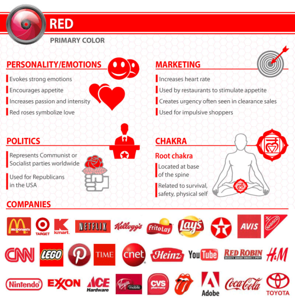
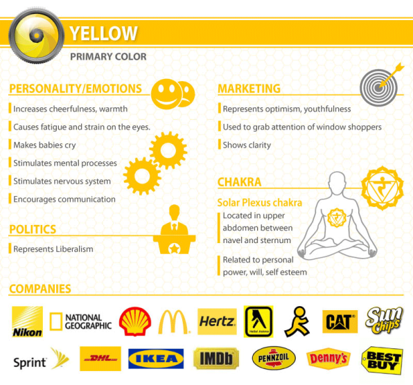
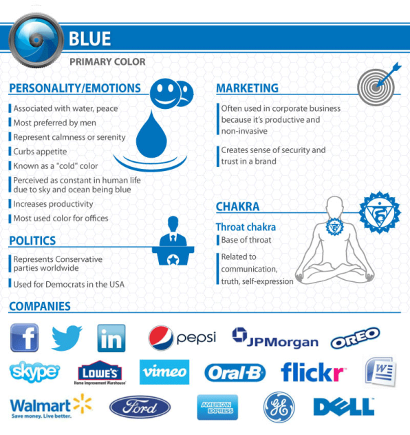
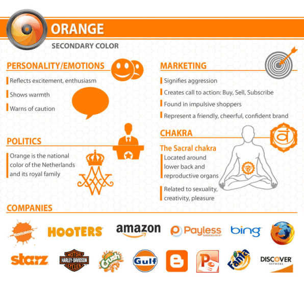
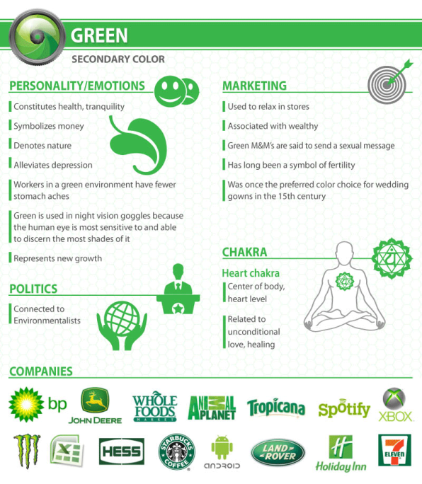
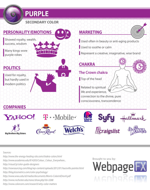
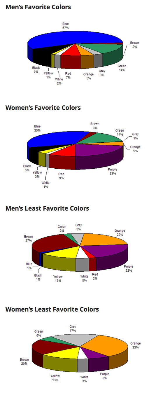
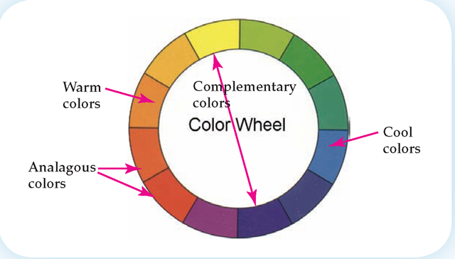
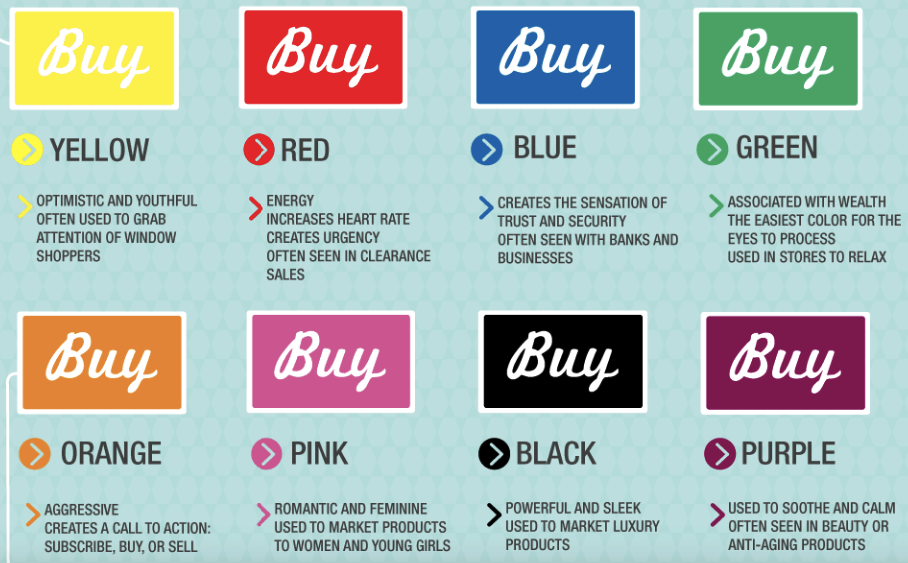
However, it's essential to recognize that colors may have different connotations in various regions.
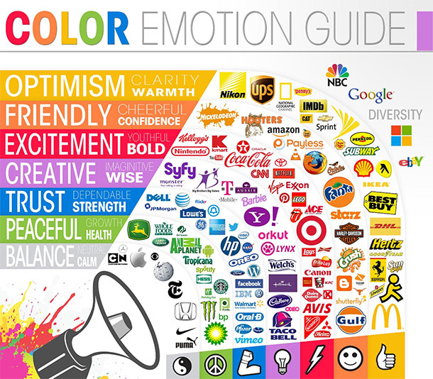
A color that appeals in the U.S. may not have the same effect in India.
The "Color Emotion Guide" is a useful resource. It illustrates the emotions linked to various colors, along with brand examples for each.
Spend time reviewing these examples and consider
the psychological implications of each color.
Consider who your website is aimed at.
Who are your potential customers? What emotions do you wish to evoke in them? These are crucial questions.
Additionally, resources like those from Fast Company offer insights into the emotions associated with common colors, which can be invaluable in understanding your target audience's preferences.
Understanding Your Audience's Personality and Emotions for Website Color Selection
When deciding on your website's primary color, it's essential to reflect on the personality and emotions of your target audience. For example, if your business focuses on organic foods, green would be an apt choice, symbolizing nature and health.
Some businesses cater to a specific gender, and understanding color preferences here is crucial.
Research by Joe Hallock on “Color Assignments” demonstrates distinct color preferences between genders.
Generally, men favor blue and are less inclined towards brown and purple, while women prefer blue and purple but are less fond of brown and orange.
These preferences are key considerations in your color scheme selection.
Another less obvious consideration is the age of your target audience.
Joe Hallock's research also indicates that color preferences evolve with age. Understanding the favorite and least favorite colors across different age groups can guide your choice if your audience falls within a specific age bracket.
If you're uncertain about your color choice, try the Grasshopper's “Color Quiz.” It asks straightforward questions about your target group and product type, providing helpful direction in just seven questions.
A common error in choosing a color scheme is basing the decision on personal preference rather than psychological insights.
For instance, if you're drawn to blue but your cosmetic company primarily targets women, opting for pink or purple might be more effective.
It's vital to differentiate between personal likes and what's best for the brand to avoid impacting sales negatively and weakening your brand identity.
Having selected your primary color, the next step is to decide the total number of colors for your website.
While there's no one-size-fits-all rule, the 60-30-10 principle, often employed in interior design and fashion, is a helpful guideline.
It suggests allocating 60% to the dominant color, 30% to a secondary color, and 10% for an accent. For instance, Quick Sprout's website exemplifies this rule with green as its primary color, complemented by white and black.
Generally, three colors are ideal for most websites. This isn't a strict rule, but it's a good starting point. Using more than four colors can lead to a cluttered and less aesthetic design.
A key aspect here is contrast - typically, websites benefit from a lighter background with more vivid foreground colors for visual comfort and appeal.
Some websites, like Wonder Bread, successfully use darker backgrounds.
Recall the color wheel from art classes? It's a valuable tool for website color selection. Choose either analogous colors (next to each other on the wheel) or complementary colors (opposite each other).
For instance, yellow and purple, or orange and red, are complementary, while orange and red are analogous.
To simplify the process, use tools like Colorspire.
They allow for quick experimentation with various color combinations, saving time and aiding in finding the perfect palette.
If Colorspire isn't to your liking, there are many other great tools available for color scheme selection.
Study at least three direct competitors' websites to understand common color themes.
This insight gives you two strategies: either align with the conventional color scheme or deliberately contrast it to stand out.
I typically advocate for the latter to foster a unique brand identity.
Instead of settling on the first color scheme that comes to mind, consider creating and comparing three or four different options.
This approach broadens your perspective and helps identify the most effective palette. Gather feedback from colleagues and business partners to understand which schemes resonate better.
Gradually narrow down your choices until you find the one that aligns seamlessly with your brand.
Crafting the right color scheme for your website doesn't require you to be a renowned artist. It's about understanding color psychology and how different hues evoke specific emotions.
Familiarity with the 60-30-10 rule and the color wheel is beneficial. Through some experimentation, you can develop a color scheme that not only suits your website but also builds an emotional connection with your audience.
This connection can lead to tangible benefits like reduced bounce rates, longer session durations, and improved conversion rates, ultimately making a significant impact on your business.