call us
be-bran-innerbanner4
Uploads

Optimizing Mobile Experience: A Guide to Responsive Images for SEO

  • 28 Feb, 2024
  • Share :

Introduction

In the era of smartphones and on-the-go browsing, having a mobile-friendly website is no longer optional—it's essential. Responsive images play a pivotal role in creating a seamless user experience across devices. This guide is tailored to equip you with the knowledge and techniques needed to ensure that your website's images adapt beautifully to various screen sizes. By the end, you'll not only enhance user satisfaction but also bolster your website's mobile SEO performance.
 

Understanding Responsive Images

Responsive images are images that adjust in size and resolution based on the user's device and screen size. They are designed to ensure that images look clear and well-proportioned on any device, from large desktop monitors to small smartphone screens.

Definition and Purpose

Responsive images are images that adapt and scale appropriately based on the screen size and resolution of the device they're being viewed on. They are a crucial aspect of responsive web design, ensuring that images look and perform optimally across various devices, from desktop computers to mobile phones.

The primary purpose of responsive images is to enhance user experience by providing visually appealing and appropriately sized images on any device. This helps maintain a consistent and high-quality visual presentation of a website regardless of the screen size.

Responsive images utilize HTML attributes and CSS techniques to dynamically adjust their dimensions and file sizes. This means they load quickly and display clearly on devices with different screen sizes, resolutions, and pixel densities.

Importance for Mobile SEO

  • Mobile SEO:

Mobile SEO refers to the optimization of a website for search engines on mobile devices. It's a critical aspect of digital marketing as an increasing number of users access websites via smartphones and tablets.

  • Mobile-Friendly Web:

A mobile-friendly website is designed to provide an optimal experience for users on mobile devices. It includes factors like fast loading times, easy navigation, and content that's easily readable and interactable on smaller screens.


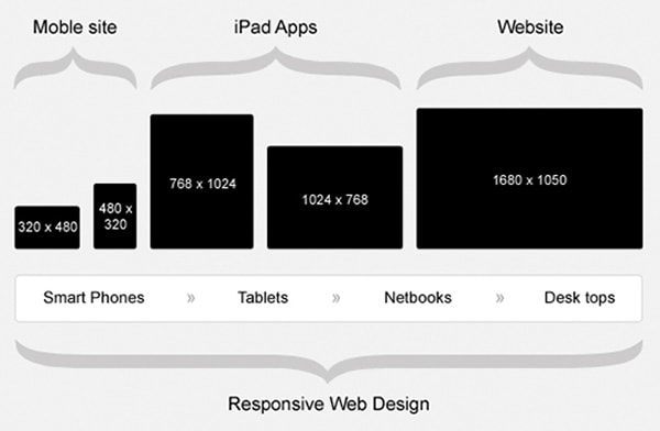
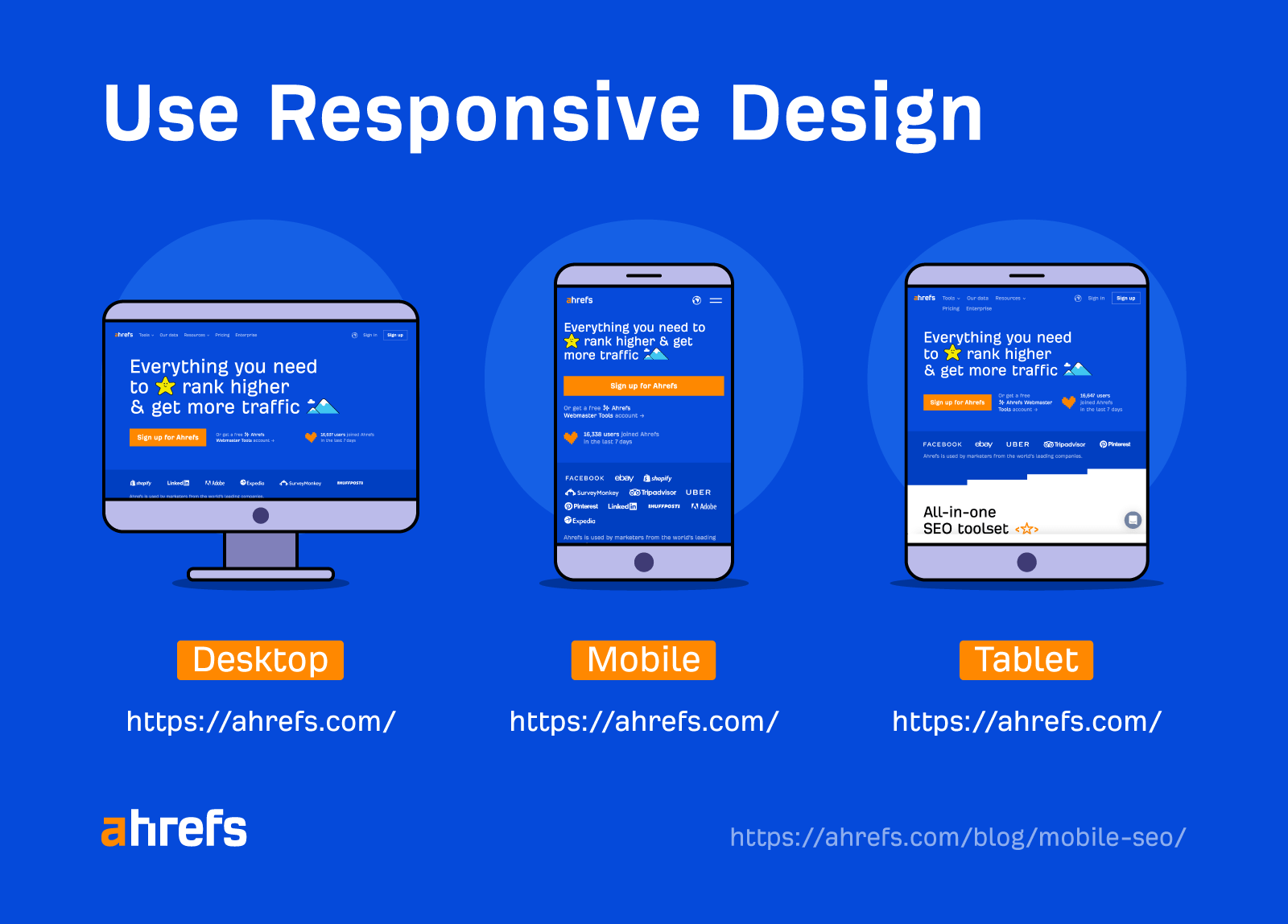
Responsive images play a vital role in mobile SEO. Here's why they're important:

Page Loading Speed: Responsive images are appropriately sized and compressed for each device, which reduces loading times. This is crucial for mobile users who often have slower internet connections.

Improved User Experience: Well-optimized images ensure that content remains visually appealing and easy to understand on smaller screens. This reduces bounce rates and encourages longer user engagement.

Google's Mobile-First Indexing: Google now primarily uses the mobile version of a site for ranking and indexing. A mobile-friendly site with responsive images is more likely to rank higher in search results.

Avoidance of Duplicate Content: Responsive design allows for a single URL to serve both desktop and mobile users. This eliminates the need for separate mobile sites, reducing the risk of duplicate content issues.

Compliance with Google's Recommendations: Google recommends responsive web design as the preferred method for mobile optimization. Sites that adhere to this recommendation are more likely to receive favorable rankings.

In summary, implementing responsive images is crucial for creating a mobile-friendly web experience, which in turn significantly impacts a website's performance in mobile SEO. It ensures that content is accessible, visually appealing, and loads quickly across a wide range of devices, ultimately benefiting both user experience and search engine rankings.

The Impact of Responsive Images on Mobile SEO

Responsive images are pivotal for Mobile SEO. They adapt to various device screens, ensuring fast loading times and optimal user experience. This aligns with Google's mobile-first indexing, boosting search rankings. By enhancing page performance and user engagement, responsive images significantly influence a website's success in mobile search.

Page Load Speed and User Experience

  • Page Load Speed:

Page load speed refers to the time it takes for a web page to fully load and become usable for a visitor. It's a critical factor in user experience and SEO. Responsive images play a significant role in page load speed, as they are optimized for different devices, ensuring they load quickly and efficiently.


  • User Experience (UX):

User experience encompasses all aspects of a user's interaction with a website. It includes factors like navigation, content readability, interactivity, and overall satisfaction. Responsive images contribute to a positive UX by ensuring that images are appropriately sized, enhancing visual appeal and accessibility.

SEO Ranking Factors

  • Responsive Images and SEO:

    1. Responsive images impact SEO in several ways:

    2. Page Speed: Faster loading times, facilitated by responsive images, positively influence SEO rankings. Google favors websites that provide a swift and seamless user experience.

    3. Bounce Rates: Well-optimized images reduce bounce rates. When users find content quickly and efficiently, they are more likely to stay on the page, signaling to search engines that the content is relevant and valuable.

    4. Mobile-Friendliness: A website's mobile-friendliness, which includes the use of responsive images, is a significant SEO ranking factor, especially since Google prioritizes mobile-first indexing.

Mobile-Friendly Website Design

A mobile-friendly website is designed to provide an optimal viewing and interaction experience across a wide range of devices, including smartphones and tablets. It ensures that content is easily accessible, readable, and navigable on smaller screens.

Importance of Mobile-Friendly Design:

  1. User Expectations: With the increasing use of mobile devices, users expect websites to be mobile-friendly. A responsive design with appropriately sized images is crucial for meeting these expectations.

  2. SEO Benefits: Google prioritizes mobile-friendly websites in search results. Responsive images are a key component of mobile-friendly design, contributing to better rankings.

  3. Reduced Bounce Rates: A mobile-friendly website with responsive images reduces bounce rates, as users are more likely to engage with content that's easily accessible and visually appealing on their mobile devices.

  4. Enhanced User Engagement: A positive mobile experience leads to higher user engagement, which can result in longer on-site durations and increased conversions.

So, Responsive images are integral to both page load speed and user experience, impacting SEO rankings significantly. They play a vital role in creating a mobile-friendly website design, which is essential for meeting user expectations, reducing bounce rates, and ultimately enhancing user engagement and search engine visibility.

Techniques for Implementing Responsive Images

Implementing responsive images involves using techniques like srcset/sizes attributes, the picture element, lazy loading, and image compression. These methods ensure images adapt to different screen sizes, enhance page loading speed, and improve user experience, vital for mobile-friendly web design and effective mobile SEO.

Using srcset and sizes Attributes

This technique involves using the srcset and sizes attributes in HTML to provide multiple image options to the browser. The srcset attribute allows you to specify different image files with varying resolutions or sizes. The browser then selects the most appropriate one based on the user's device capabilities and screen size. The sizes attribute defines the layout slots for the image, helping the browser make accurate decisions.

Utilizing the Picture Element

The element is a powerful tool for serving different image sources based on conditions like screen width, pixel density, and media queries. It allows you to provide a variety of image sources and let the browser choose the best one for the current context. This is particularly useful for complex layouts or when you need precise control over which image is displayed.

Lazy Loading for Improved Performance

Lazy loading is a technique that defers the loading of non-critical resources (such as images) until they are needed. This means that images outside of the user's immediate view are loaded only when the user scrolls down to them. This can greatly improve page load times and performance, especially on mobile devices with limited bandwidth or slower connections.

Compressing Images for Mobile

Compressing images involves reducing their file size without significantly compromising their quality. This is crucial for mobile devices, which may have slower internet connections or limited data plans. By optimizing images for mobile, you ensure that they load quickly and efficiently, contributing to a smoother user experience.

Testing and Validating Responsive Images

Page Load Speed:

  • All of these techniques contribute to faster page load times, a critical factor for mobile SEO. A fast-loading website, with properly implemented responsive images, is favored by search engines.

User Experience (UX):

  • These techniques directly impact user experience on mobile devices. Images load quickly, adjust appropriately to screen sizes and enhance overall visual appeal, which leads to higher user engagement and lower bounce rates.

Mobile-Friendly Web Design:

  • Implementing responsive images is a cornerstone of creating a mobile-friendly web design. They ensure that visual content is accessible and visually appealing on various devices, aligning with Google's mobile-first indexing and improving a website's mobile SEO performance.

These techniques for implementing responsive images are crucial for creating a mobile-friendly web design and optimizing for mobile SEO. They improve page load times, enhance user experience, and contribute to a seamless visual presentation across different devices, ultimately benefiting both users and search engine rankings.

Google's Mobile-Friendly Test

Google's Mobile-Friendly Test is a tool provided by Google that allows website owners to check if their site meets the mobile-friendly criteria set by Google. It evaluates various aspects of a website's mobile compatibility, including responsive design and image optimization.

  • Testing Responsive Images:

    • When using the Mobile-Friendly Test, specifically assesses how well images on a webpage adapt to different screen sizes. It provides feedback on whether the images are appropriately scaled and formatted for mobile devices.

  • Mobile SEO Impact:

    • A positive result from this test indicates that the website's responsive images contribute to a mobile-friendly user experience. This, in turn, can positively impact mobile SEO rankings, as Google prioritizes mobile-friendly sites.

Lighthouse Auditing Tools

Lighthouse is an open-source, automated tool for improving the quality of web pages. It audits various aspects of a web page's performance, accessibility, SEO, and more. It's particularly useful for evaluating the mobile-friendliness of a website.

  • Responsive Image Evaluation:

    • Lighthouse includes checks and audits for responsive images. It assesses whether images are appropriately sized, uses modern image formats, and provides recommendations for improvement.

  • Mobile SEO Benefits:

    • Passing Lighthouse's responsive image audits ensures that images are optimized for mobile devices. This positively impacts mobile SEO by contributing to faster loading times and an overall improved mobile user experience.

Browser Developer Tools

  • Definition:

    • Browser Developer Tools are built-in features in web browsers that allow developers to inspect, debug, and analyze web pages. They provide insights into various aspects of a webpage, including how it renders on different devices.

  • Using Developer Tools for Responsive Images:

    • Developers can use browser developer tools to simulate different screen sizes and view how images respond. This helps in identifying any issues with image responsiveness and allows for real-time adjustments.

  • Mobile-Friendly Validation:

    • By testing responsive images using browser developer tools, developers can ensure that images adapt appropriately to various screen sizes, ultimately contributing to a mobile-friendly web design that aligns with mobile SEO best practices.

Let’s Contact

Follow Us on

Resources

Payment methods: Visa
Buy With Confidence: Ssl